Sportsbet
Promotion Landing Pages
CLIENT
Role
Research, UI/UX design, Art direction, Design lead
These responsive pages act as a portal between referrals from various sources and the Sportsbet main site. They always display the relevant content and send users to the appropriate section on the main website.
The challenge
The landing pages were getting unnecessarily complicated with too many messages and calls to action. There were too many redirections and some of them went to a dead end. The overall UI also looked tired and dated. We really needed a way to simplify the user journey and experience, while making the design more aesthetically pleasing.
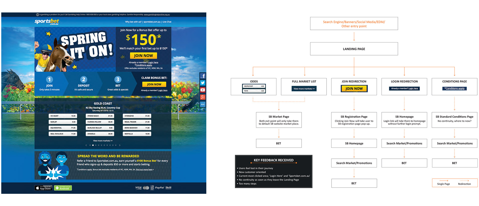
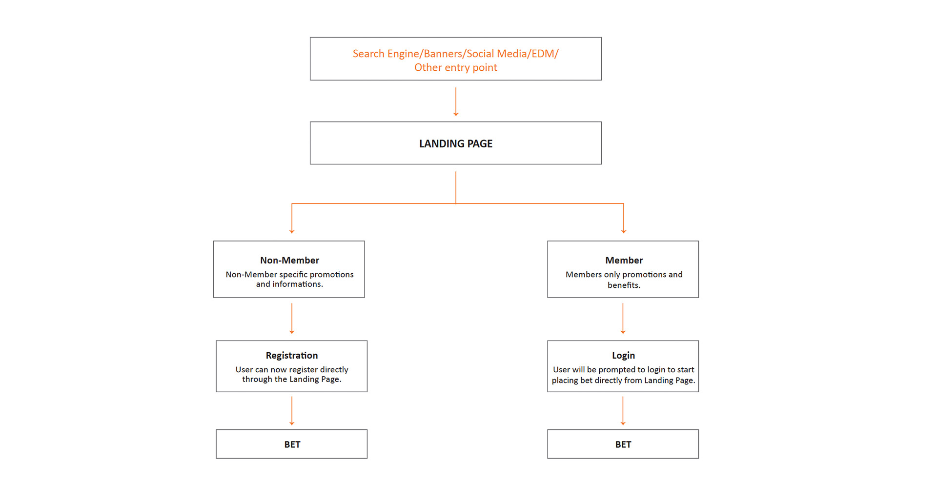
Old landing page example and user journey
Execution
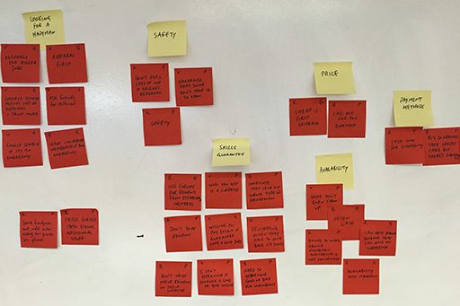
In collaboration with a dedicated researcher, I helped in conducting initial surveys and subsequent face to face interviews. Our initial assumption that users were feeling lost in their journey were indeed validated, making a compelling case for a complete review. We also discovered some other pain points that we didn’t think of, the main one being that the pages were very ‘new customer oriented’. Existing users were feeling alienated as a result.
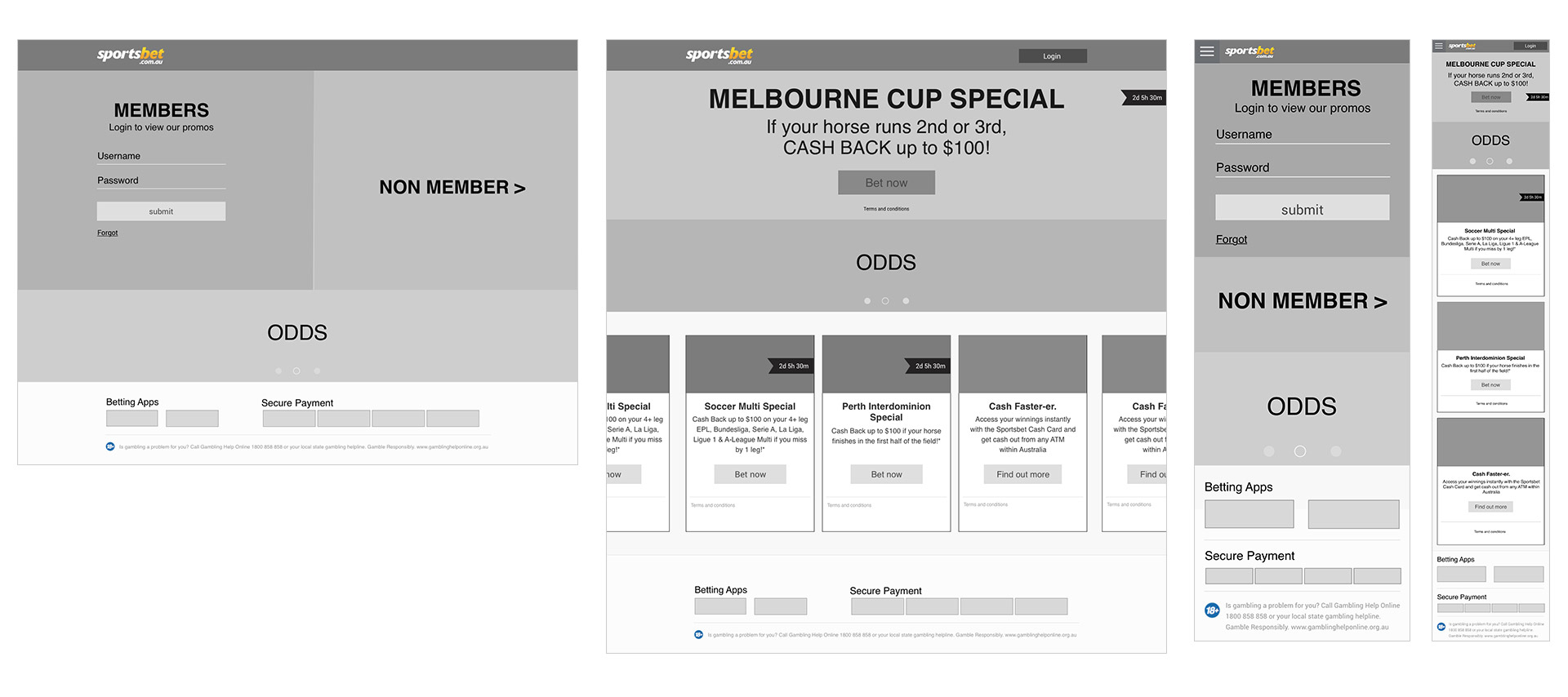
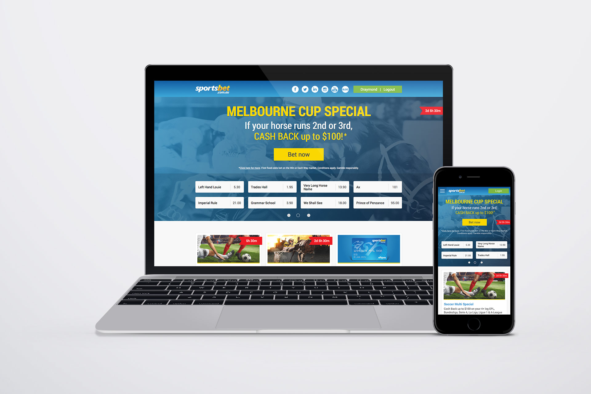
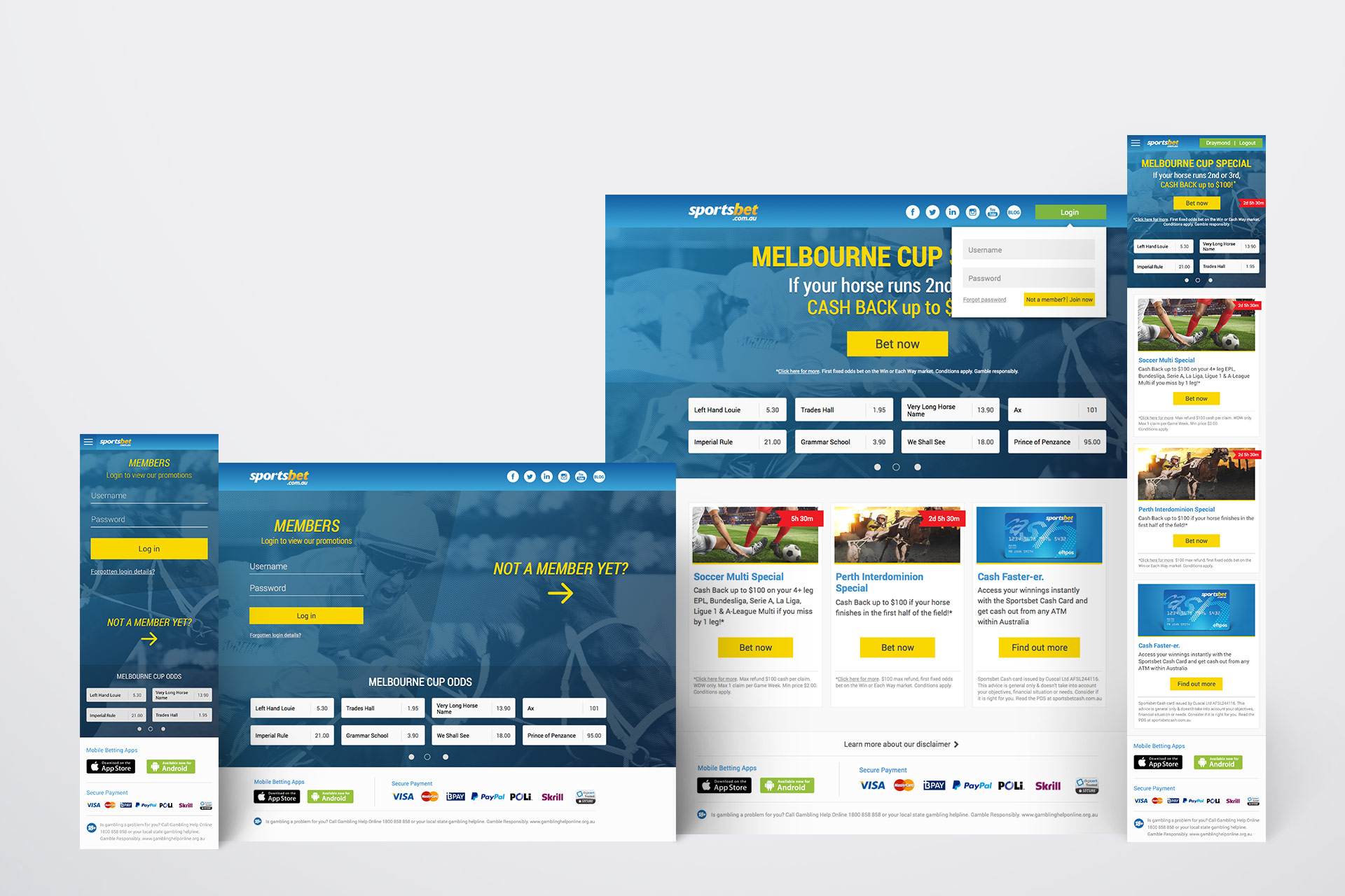
Making use of these insights, I set out to find solutions that could resolve the pain points that we have prioritised. The main hurdle was to strike a balance between technical, legal and solving customer problems. I redesigned the user journey and devised the responsive wireframes. After some iterations from feedback, I designed the UI with the purpose of removing superfluous visual noise.
Making use of these insights, I set out to find solutions that could resolve the pain points that we have prioritised. The main hurdle was to strike a balance between technical, legal and solving customer problems. I redesigned the user journey and devised the responsive wireframes. After some iterations from feedback, I designed the UI with the purpose of removing superfluous visual noise.
Outcome
I created a much simplified user journey and made the landing page have a clear purpose again. It's a single page solution to allow users to access, login, registration, place a bet and view terms and condition without the need to leave the landing page. Working with developers, we created a prototype that underwent user testing and were also A/B tested with real customers. While more iterations and testing are required before complete migration, results so far have been really encouraging with an increase in conversion rates (completed user journeys), especially on mobile.
